Responsive and Adaptive Web Design

What is Responsive Design?

When we hear the term “responsive” or hear someone mention that a website is “responsive”, we automatically think that it means the site is built for a mobile device. While that notion isn’t untrue, it is actually a little bigger than that. To have a responsive website means that your site’s content is accessible on any device — regardless of size.

Responsive design is fluid.

What is Adaptive Design?

Often you will hear responsive design and adaptive design interchangeably. However, these terms do not hold the same meaning. Adaptive design is the process of defining the breakpoints in your design to fit a specific screen size.

The adaptive design concept became relevant when mobile devices and tablets first hit the market. Initially, there were only a few different screen sizes to contend with and so adaptive design principles were put into place to solve the issue of trying to access the web from these devices. Instead of having a streamlined experience delivered to the end-user as with responsive design, adaptive design delivers different experiences based on the size of the screen.

Which is better? Responsive vs Adaptive

Google recommends responsive web design  over adaptive design as the html is exactly the same on the desktop version of the site as it is on the mobile version. This comes full circle with the earlier point about responsive design being accessible across any device, regardless of screen size.

What are some of the Primary Keys to Responsive Web Design?

  • Responsive design is fluid and the grid is based on relative sizing (ex: using percentages to define width instead of pixels)
  • Images & Video scale as width changes
  • Considers mobile visitors first. An example of this is by making sure to hide any unnecessary desktop design elements that might get in the way of the content
  • Content should adapt to screen size


Creative Commons: Where Free is Not Actually Free

Copyright and the Creative Commons License

In today’s world it is not uncommon for photographers, graphic artists and folks in other fields to submit work to the community that can be freely used in other projects. I’m sure you’ve heard of sites like Wikimedia and Morguefile (just to name a couple) that have photos listed for use under the Creative Commons license.

A Creative Commons (CC) License is only one of the public copyright licenses that exist today. A CC license is one that enables free distribution of work submitted by an author who wants to give permission to the community to use the work they have created.

At first glance, a CC license seems to mean “free” as in, you can freely edit and distribute the work in any manner you wish. However, each author can set limits or stipulations on how their work can be used. For instance, some authors prohibit commercial use of their work. This means, people can not use the work to help them make money — by either including it in a product that will be sold or something that helps them sell their products. Other authors will give you mostly free domain to use their work. However, they want credit for it. So, if you do happen to use their photograph, graphic design element, etc. they want their name on it somewhere for credit.

Sometimes the stipulations that authors place on their work is very transparent and easy to follow. Sometimes, the stipulations are vague. In other instances, people can forget to look at the requirements or ignore them altogether. The lines can get blurred and that’s where the trouble can start. For instance, just recently Festival delle Resistenze 2016 in Italy was sued for using a photo found on Wikimedia of one of the people who presented at the festival. The photo was taken by a local photographer and shared on Wikimedia under the CC license with the stipulation that credit would need to be given to the photographer in exchange for use of the photo. The festival took the photo and used it in marketing materials to promote the presenter but did not credit the photographer. From that mistake a lawsuit was born.

Knowing how and when to use CC licensed work can be quite an ordeal!

Our clients have the ease-of-mind in knowing that when they ask us to create a banner ad or other graphic materials, we have access to a full stock photo library that we can use without stipulation. We are either the authors of the content we use or we pay a license fee for use. We take copyright very seriously for the safety of our clients.

Learn More About Copyright:


After the Launch…

You have just launched your brand new website. The graphics and colors are slick and it is smartly responsive. You’ve got a brand new site and it’s ready for current and potential members to see! Now, you only need to sit back and watch the visitors roll in. Right?

What you do next after the launch of your new site is just as important as the planning and time that went into the build of it. Since your website is the digital front line to your organization, you want to spend time promoting and learning new ways to interact with your intended audience.

Some questions to ask:

  • How do I want members or potential members to interact with the site?
  • How are potential and current members interacting with the site now?
  • Are some areas of the website more popular than others?
  • Which pages are receiving the most attention?
  • How can I leverage page or article popularity to help guide visitors to the latest promotion or to interact and explore?

Listed below are some ways you can place attention to your online presence and use your website to innovate growth.

Promote Your Content. Promote Your Site.

Promote the content on your website. Leverage social media outlets like Twitter, Facebook, LinkedIn and YouTube to help spread the word. When you are promoting your website, don’t just link to the latest loan promotion. Create content that is worthy of sharing. Educate and give to your audience.

Become an Expert and Share.

Become an expert in your field. Post articles that are specific to things happening in your industry. Today in this age of information you have the ability to engage and educate. Teach your members and potential members the ways of the industry. Give them the power of knowledge that will better help them manage their finances. This is great for your members and great for your website’s SEO. You will rank higher in search engines and the ability to find you on the internet will be easier. Give and you will get.

Pay Attention and Analyze.

Google Analytics is an important tool. If it’s not implemented on your current website, it should be. It gives you the ability to look at your analytics reports and study the data. You can find out how people are interacting with your site. You will be able to gauge the success of your current loan promo, find out where the hot spots on your site are and then leverage those spaces to your advantage — to better serve your members and help potential members find the important information quickly.

Utilize other services such as AdWords and Facebook retargeting so that you can reach members no matter where they are on the web.

Optimize and Evolve.

Armed with data from “pay attention and analyze”, you should then be able to optimize your site for better user engagement.

Build landing pages for 1:1 engagement with certain promotions. If  current ad-graphics aren’t getting as much attention or as many clicks as you’d like, create new ones with a few changes based on the data you have collected. Once you do that, you can compare results and gauge improvement.

In all of this, the most important thing to remember is to keep moving forward. Your website will never really be “finished”. Nor should it be. It should always be evolving to help your organization grow by meeting the needs of your members.

After the launch is when it really begins.


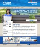
Muskegon Co-Op Launches New Website

Muskegon Co-Op Federal Credit Union - New Website

Congratulations to Muskegon Co-Op Federal Credit Union on the launch of their new site design! The new design utilizes WordPress with Site Control and includes responsive support for mobile devices, the Online Banking Widget, and featured rates. Check out the new site design today at https://muskegoncoop.com

4 Essential Features for Your Credit Union Website

Your website is the digital front line that introduces your brand and your business to the world. Current members visit your site to get the latest information and current promotions as well as online banking. Non-members use your website as a platform to window shop while they are on the search for their financial home. What you display or don’t display on your website, can leave a lasting impression.

Listed below are some essential features that every credit union website should have:

Responsive Web Design with Intuitive Navigation

In 2016, a website that is not responsive (i.e. is able to be viewed and used with ease on any device) will suffer in search results and page ranking with Google and other search engines. With a fixed and unresponsive site, you are losing users as they will be more likely to leave your site in frustration.

A responsive website means that you are able to extend your reach to all users, regardless of the device they choose to view your website with.

In addition to a responsive site, your site’s navigation should be straight-forward and clean. You want to be sure that your website’s navigation is focused so that people can find what they are looking for fast and easy.

Is your website mobile responsive with intuitive navigation?

Learn more about our website services

Check out our Portfolio

Contact Information

Despite that we are in a digital age, people still want to deal with people directly.

Make sure that your contact information: physical address (and mailing address if applicable), phone number and email addresses are easy to find. Generally speaking, people will use your website to get some basic information and then will contact you when they are ready for more. Making these essential contact avenues readily available will give your users the impression that you are accessible and that you want their business.

Promotional Space & Focused Marketing

While it might seem like a good idea to put banners and other ad graphics in every pixel of whitespace on your website, this method also leads to user confusion.

Your visitors aren’t sure where to focus their attention, so they are focused on everything, which means they aren’t taking in the important calls to action and time-sensitive promotions.

By giving your website specific promotional spaces while using focused marketing with your content and graphics, you can lead your visitors exactly where you want them to go!

Got a great spring promotion that you think is too good to pass up? Make that a featured promotion on your website’s dedicated promotional spaces.

The Membership Application Process

The Membership Application Process (MAP) should be a fairly streamlined and easy process to walk through on your website. Ease of use and focused steps for your users to take to sign up means a higher conversion rate and more members!

Did you know that CU*Answers offers a great MOP / MAP program? We have created attractive, modern and user-friendly experiences for credit unions to use for new membership sign-up.

Learn more about MAP

Learn more about Custom Branding, MAP & MOP


Have you incorporated some of these features on your website? What do you find to be the most important feature on your current site?

3 Image Formatting Mistakes to Avoid on your Website

We’ve already established that well-written content on your website is the key to SEO success but sometimes it takes more than that to draw your audience in and entice them to stay. They say that a picture is worth a thousand words. On your website this is especially true because that picture could turn a casual lurker into a lifelong member.

Adding images to your website is essential because it helps you communicate to your audience more effectively. Some people are very visual and so when they get hit with a wall of words, it can be overwhelming. That is why the use of imagery is one of the most powerful tools used in marketing today.

However, while images are powerful and essential, they can’t be effective if they aren’t displayed correctly on your website. Listed below are the top 5 image formatting mistakes to avoid:

1. Uploaded images are not optimized for web

Uploading images that are not optimized for the web can be an issue that slows down your website and increases load time. This happens because the file size of the image used is simply too large.

Helpful Tip:  If you have an image editing tool such as Photoshop, you will be able to optimize your images for the web easily.

2. Uploaded image is not displaying correctly

If you upload an image to your website and it looks blurry, then that can mean one of two things:

    • The resolution for the image is incorrect: You will want to make sure that you have an image resolution of 72 ppi to 120 ppi. Unlike print design, you can get away with a much lower resolution for the web.


  • The original image was small and re-sized larger. Many times, when you take a smaller image and make it bigger, it doesn’t always work out as the resolution for the original image was low and the image itself is not in a vector format. That means, when you size it up, it takes the ppi resolution that it has and stretches the pixels thereby making the picture blurry.


Helpful Tip: For the sake of image quality, it is much better to reduce the size of a large image and place it on your website than to take a smaller image and increase it in size.

3. The image looks disproportionate

You found the perfect image for your website but it is portrait and you need a landscape image. So, you decide to re-size the image so that it is wider instead of taller. When you upload it on your site, you notice that it looks odd.

Helpful Tip: Before you look for an image for your website, be sure to decide whether you want it to be in portrait format or landscape format. If you find a very large image you can sometimes crop it to the desired format (depending on the image), but I have found that it is easier to know which format you need before you find the image, that way you don’t have to deal with that hassle later on.


SEO Tip for Images - Lightbulb IconSEO Tip for Images: Don’t forget to give your images alt tags with descriptions when you upload them. Not only does this make your images more accessible for handicap users, it also adds to your website search engine optimization and helps your site rank higher in searches!