
Click to enlarge
When I started at CU*Answers nearly 10 years ago, our web site designs targeted an 800×600 browser size. This was considered the standard at the time. This meant that we considered the viewable space on any monitor with the web browser at full screen as 800 pixels wide by 600 pixels tall.
Over the years, the best practice moved to 1024×768 resolution and many sites were designed with this in mind. If you can picture these dimensions in your head, and relate them to TVs, you’ll notice they are the older square shape of TVs. It’s nearly impossible to find these now. TVs, and likewise computer monitors have moved to the wider letterbox, rectangular shape like cinema movie screens.
Also, note we’re talking about actual pixel real estate on your monitor, not the actual real world dimensions. You could have a huge monitor that runs at a low resolution (think of a sports score board) or a small monitor that runs at a high resolution (think your smartphone.) We’ve talked about the differing screen sizes and resolutions over the years – here and here for example. W3 Schools has some interesting trend data on resolutions also.
What screen resolution is the current best practice?
Well, that’s surprisingly difficult to answer. CU*Answers Web Services recently did an evaluation of all the screen resolutions that visit the It’s Me 247 Online Banking Community. This represents the members’ resolutions we should be targeting when we develop your website. The results are overwhelming.
- The axes represent the pixels, horizontally and vertically, naturally.
- The size of the circle indicates the relative popularity of the screen resolution.
- The overall quantity of circles showcases the vast variety of resolutions.
- This chart is graphing about 4.2 million sessions over the course of 2014.
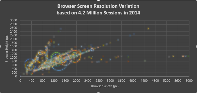
As you can see, this is a very complex issue. The crux of it being, the monitor and screen resolution you are using is very unlikely to be the same as the average member.
If you have done a website redesign with us you likely got a mockup that included relative screen resolutions overlaid on your mockups. Like this example.
We’re attempting to show you how some common screen resolutions will view your site. But don’t get pulled into the myth of having to have everything “above the fold.” Study after study has shown that your website visitors scroll. There is no fold. See Myth of the Fold, UX False Beliefs or our last screen resolution discussion for sources.
And we haven’t even begun to talk about the proliferation of mobile screen devices. Although the general web trend is that more and more members are visiting web sites on mobile devices, this doesn’t appear to be the case with credit union websites. Although, we do see this with some non-credit union sites we manage. The majority of access to your credit union site is still from a desktop. For example, this sample credit union site is still over 70% desktop access.

This ratio (70% desktop, 20% mobile, 10% tablet) is mostly standard across our credit union sites.
However, we have noticed mobile access trending significantly in the last 18 months and we expect that trend to continue.
Enter responsive web design
Web Services has been including responsive web designs for a couple years. Responsive web designs adjust to different screen resolutions, thus solving both mobile access and the chaotic resolution graph above, while utilizing the same content. This means you are only maintaining one website’s worth of content and that content adapts to the browser’s screen size.
Web Services is working with some clients right now who are pretty aggressive in pursuing mobile sites through our responsive web designs. Below are some examples of great looking mobile responsive designs (remember to view them on your smartphone.) Several of these are currently in development, so you are looking at their test sites.
Responsive web design is the best tool we have right now on the web for showing visitors a single version of your website in a way that best adapts to their screen. As technology advances in high dpi screens we expect the numbers to continue to shift. We’ll continue to determine the best and most practical practices for our clients to help visitors see the best version of your site possible.